Most restaurant operators and owners make the exact same mistake when they design their website. The first thing they think about is pictures of food. While that’s certainly helpful and arguably pretty important, it’s not even in the top 5 most important things to have on your website.
First thing is first – before you start designing you site, ask yourself “who is our target customer?” A fine dining website and a coffee shop website have needs as vastly different as the target audience. Make sure your layout, look and feel speaks to the key customer you want to walk through the door.

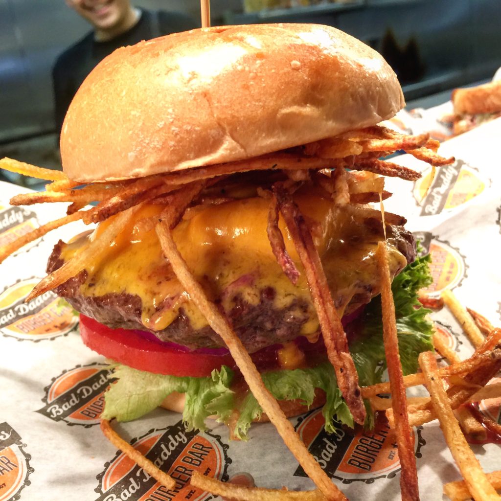
The Bad Daddy’s Burger Bar Pitsburgher – Housemade American cheese, shoestring fries, spicy garlic ketchup, leaf lettuce, tomato and red onion. Photo courtesy of Chef Tim Kast.
Once you’ve determined what kind of site you are going to make, there are a few key things to think about, and think about first when designing the layout for the website. Put yourself in the customer’s shoes. Most people to forget what it’s like to be a customer when they build out their restaurant website. To avoid this, think about when you are checking out the website for a restaurant either you heard about or maybe happened upon while traveling. Now ask yourself, “what is it you want to know?”
- Address
- Phone number
- Hours of operation
- Menu
- Contact
- Social networking links

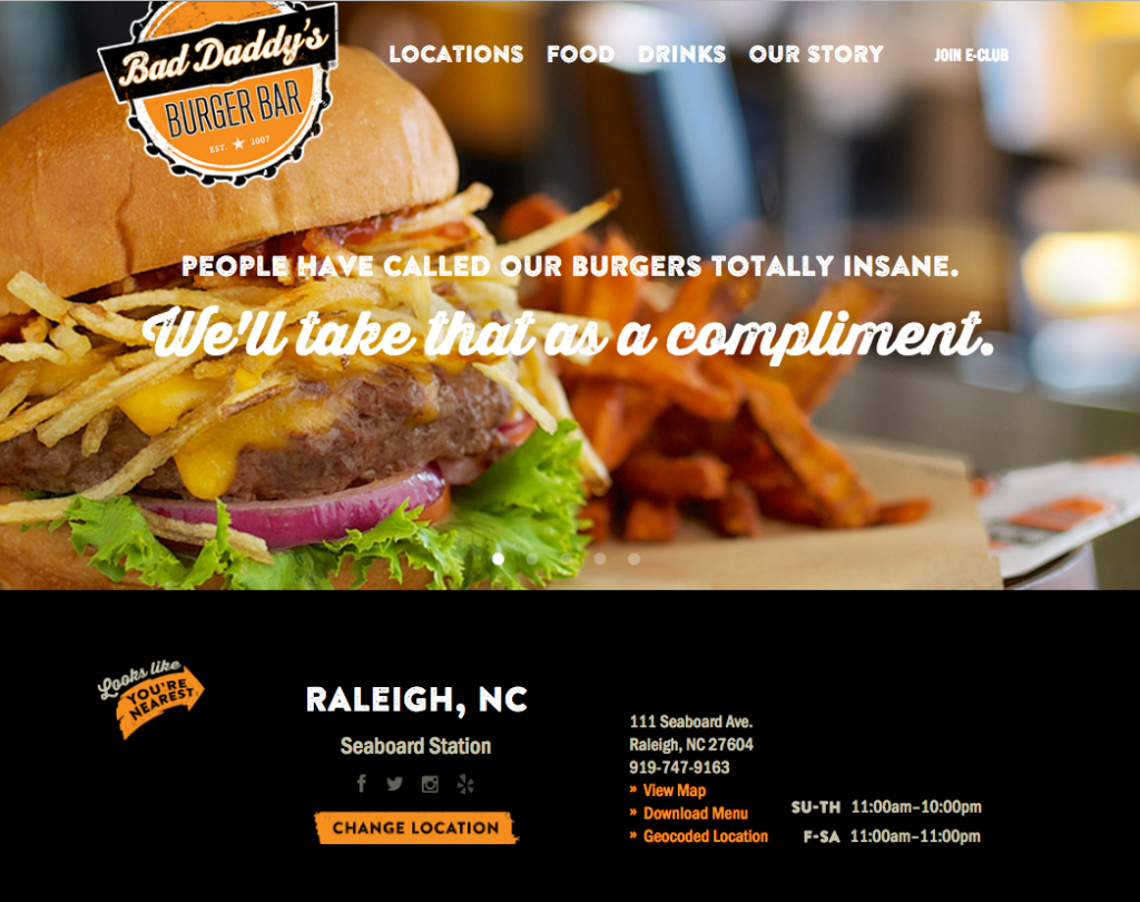
When people hit your site, they want to know, as quickly as possible, how to find you, what you offer and what time you are open. Yes, I said 5 in the title of the article but there are really 6 but the other 5 are absolutely, 100% crucial to your success. The social network links should be there for those who want to take it one step further. Here’s the key point to the whole thing, the magic moment if you will; make all of this easy to find by putting it at the top of the site.
DO NOT MAKE PEOPLE SCROLL TO THE BOTTOM OR CLICK TO FIND THE INFORMATION THEY NEED THE MOST.
Something also to keep in mind, mobile search is on the rise, especially with local businesses. That’s even more reason to make these important items easy to find on your website. Think about how annoying it is to click around trying to find something on your mobile web browser when all you want is something to eat!
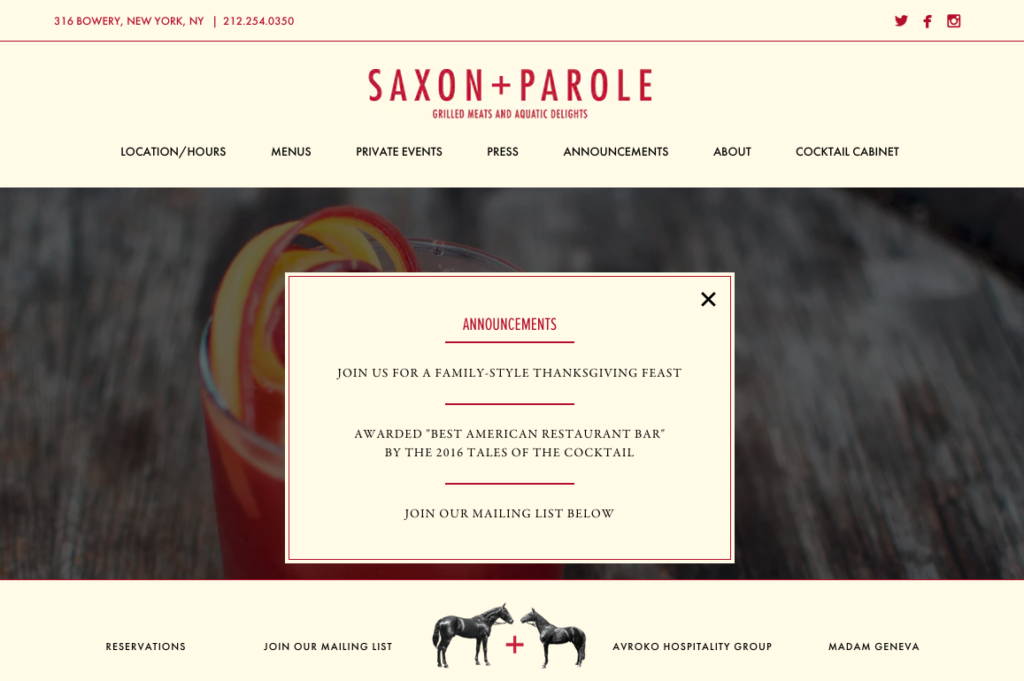
Check out this example from Saxon+Parole in NYC; they have everything you need, easy to find and even the ability to sign up on their email list.
- Make the most important information on your restaurant’s website easy to find.
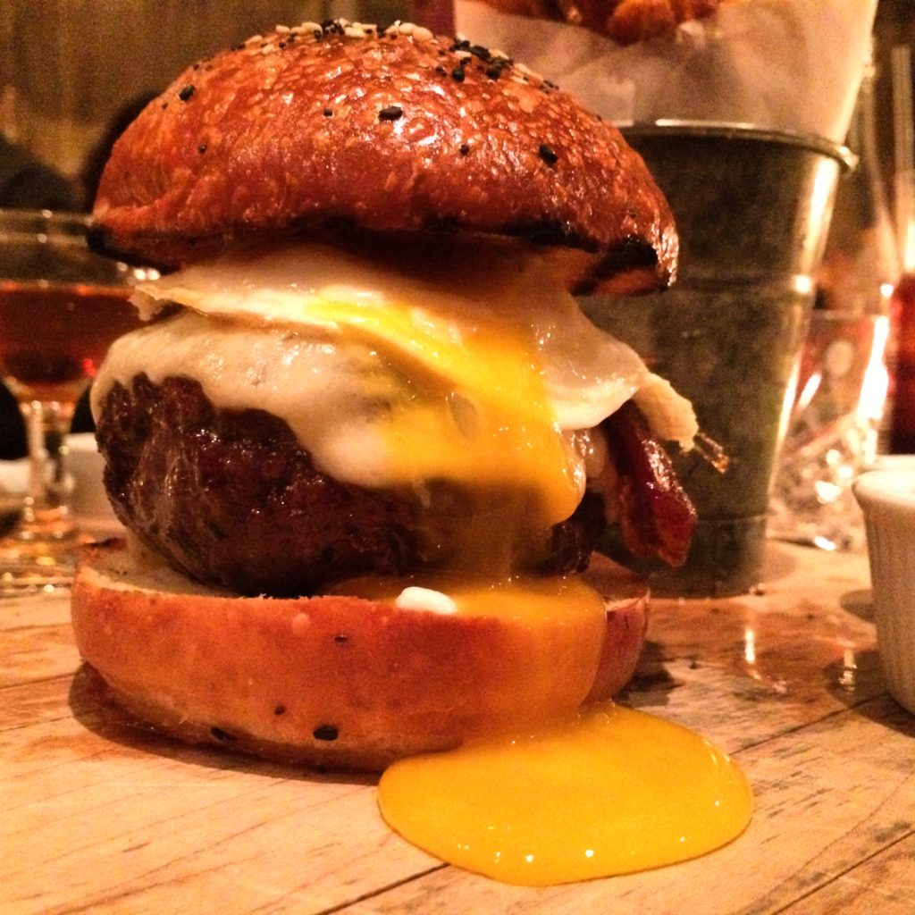
By the way, they have an excellent Burger at Saxon+Parole!


